
Thursday, 12 December 2013
Thursday, 28 November 2013
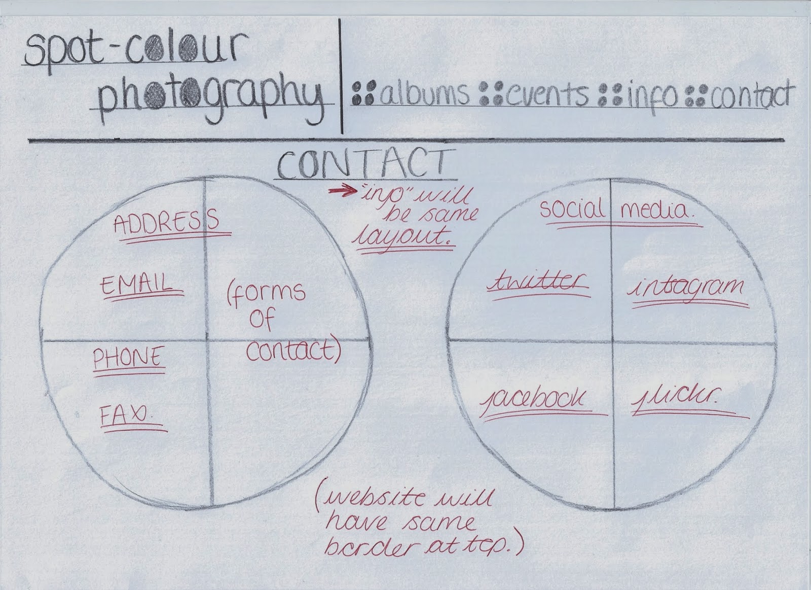
Tuesday, 19 November 2013
BRANDING - LOGO, COLOUR, SHAPES

Above is the final style of my branding/logo for my website, on each page will have this border, as its minimalistic and allows the user to get around the site more easily.

To the left is my logo for my site and my overall branding to be recognised easily by the audience.
With influence from other photography sites I wanted to keep it simple, with just my name so it would be easier to find. At the same time, I wanted my personal logo to stand out. With the text in a simple font (Bellarose) and the colour a light grey, it reinforces that the focus is on the photos and nothing else. However, to give the logo a personal identity almost, I played on the word spot and coloured in the "O" in a calm blue. And the four circles are a continual representation throughout the site.
Also, I chose the grey and blue alongside each other as they work best against the white background, and they balance each other, like one colour isn't over powering the other, so its easy on the eye. When creating the logo I did research what colours can represent, and commonly blue showed a sense of calmness and shows perspective, which will allow the user to read into my images easily. Yet, the grey balances it out by representing security and maturity, suggesting a seriousness of the site.
 To the right in the moving gif, it shows the pages that will be seen in my site. Obviously, to keep the brand identity, the text will be in grey and lowercases, with the four circles acting as a bullet point. Again, this keeps a continuity for the audience, and emphasising that this is my photography site.
Saturday, 16 November 2013
ALBUMS WITHIN THE WEBSITE

- Portrait
- Landscape
- Landmarks
- Shoots
I wanted to have a number of albums, firstly to show off my photography skills and show the audience that I am proud of my works, that I'm a versatile photographer.
Also, I have a number of different images that I am able to show of the editing skill of spot-colour and put the emphasis on sections in the images that I want the audience. Almost make them appreciate what I see in a photo.
Tuesday, 12 November 2013
FONTS

When looking at other photography websites mostly all of them had little text, but when there was the font style and colours were simplistic and minimal. To find the font for my site and logo, I looked at DaFont.
This site has a large range of different style fonts for any reason, like horror texts or sci-fi. When looking for mine, I focused on simple and almost boring styles, as I wanted my site to be about the images.

Once I got the text I started to play around with the logo and branding and in the bottom image you can see the beginning works of the logo for my website.
Friday, 8 November 2013


Tuesday, 5 November 2013
Tuesday, 29 October 2013
MULTI - MEDIA PRODUCTION TASK
The task set for this semester is to produce a website via the programme Dreamweaver. The website can be creative based or research oriented on a subject area of my interest. Also, the site can be off of another website, for instance a page off a gallery or museum website, even set up a charity page. Lastly it can be a commercial or business based website. Overall, its got to be a new kind of idea and contain a minimum of 5 pages, and create a branding.
Subscribe to:
Posts (Atom)